

Visualising Data#
Pandas works well with Matplotlib and consequently Seaborn. Once the data is plotted outlyers can be quickly seen. Most plots are 2D, but sometimes it is important to see the relationship with more than 2 variables. Use colours to show string variables, categorized variables might be shown as different point types and changing the size of the points might show another variable.
When first visualising data start with simple plots to highlight the strong and weak relationships and to check on the data. Once the data has been cleaned then the output can be selected and customised for publishing. In the following plot Plotly was used, this was saved as an html file which allows one to use cursors with balloon text, which is nice to have on a site such as this.
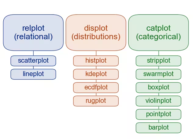
Seaborn Methods of plotting.#
The first row after the headers are default values.
Seaborn works well when working interactively, if necessary add mplcursors to obtain a cursor as balloon text.
Show/Hide Code brewery_sea_hue.py
import seaborn as sns
import matplotlib.pyplot as plt
import pandas as pd

sns.set_style('darkgrid')
df = pd.read_csv("../csv/brewery.csv")

sns.scatterplot(data=df, x='calorific_value', y='alcohol', hue='beer_type')

#plt.show()
plt.savefig('../figures/br_sea_hue.png')
Note
Plotting in Sphinx
In order to display the actual Seaborn plots the modules are reimported for each script, when working interactively this is not required.
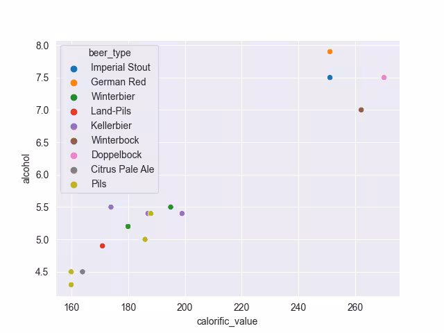
The first seaborn script shows a similar plot to the plotly script, as one would use in an interactive session. The colours of the points are probably good enough for the final plot, Plotly colours were based on the seaborn palette so the customised seaborn plot has a matching palette.
Show/Hide Code brewery_custom_hue.py
import seaborn as sns
import matplotlib.pyplot as plt
from matplotlib.patheffects import withSimplePatchShadow
import pandas as pd
import mplcursors

sns.set_style('darkgrid')
df = pd.read_csv("../csv/brewery.csv")
df['original_extract'] = pd.to_numeric(df['original_extract'], errors='coerce')
df = df.dropna(subset=['calorific_value'])

colour_pal = {'Imperial Stout': '#1a1a1a', 'German Red': '#e8000b', 'Winterbier':
    '#ff7f00', 'Land-Pils': '#a6cee3', 'Kellerbier': '#b15928', 'Winterbock':
    '#6a3d9a', 'Doppelbock': '#6a3d9a', 'Citrus Pale Ale': '#fb9a99', 'Pils': '#1f78b4'}

def show_hover_panel(get_text_func=None):
    cursor = mplcursors.cursor(
        hover=2,  # Transient
        annotation_kwargs=dict(
            bbox=dict(
                boxstyle="square,pad=0.5",
                facecolor="white", # colour_pal,
                edgecolor="#ddd",
                linewidth=0.5,
                path_effects=[withSimplePatchShadow(offset=(1.5, -1.5))],
            ),
            linespacing=1.5,
            arrowprops=None,
        ),
        highlight=True,
        highlight_kwargs=dict(linewidth=2),
    )

    if get_text_func:
        cursor.connect(
            event="add",
            func=lambda sel: sel.annotation.set_text(get_text_func(sel.index)),
        )

    return cursor

def on_add(index):
    item = df.iloc[index]
    parts = [
        f"Brewery: {item.brewery}",
        f"Beer Type: {item.beer_type}",
        f"Calorific Value: {item.calorific_value:,.0f}kJ/100ml",
        f"Alcohol: {item.alcohol:,.1f}% v/v",
        f"Original Extract: {item.original_extract:,.1f}°P"
    ]

    return "\n".join(parts)


g = sns.relplot(data=df, x='calorific_value', y='alcohol', hue='beer_type',
        palette=colour_pal)
g.set_axis_labels("Calorific Value kJ/100ml", "Alcohol % v/v", labelpad=10)
g.fig.suptitle("Alcohol v Calorific Value for Various Beers")
g.legend.set_title("Beer Type")
g.despine(trim=True)
show_hover_panel(on_add)
plt.show()
#plt.savefig('../figures/br_custom_hue.png')
This seaborn plot shows how to customise the hue with a dictionary, adding overall title, axes labels and legend title. Mplcursors has been added to give balloon cursors, as a result ensure that the column original_extract has been converted to numeric, or else the float format will not work (used on the balloon cursor). The empty values in the column calorific_value throws the cursor indexing so two of the Pils points showed up as Pilsner Urquelle on the cursor instead of Zlaty Bazant or Topvar, so drop these rows:
df = df.dropna(subset=['calorific_value'])
Hint
To View the Balloon Cursors Working
Load the script into a Python session.
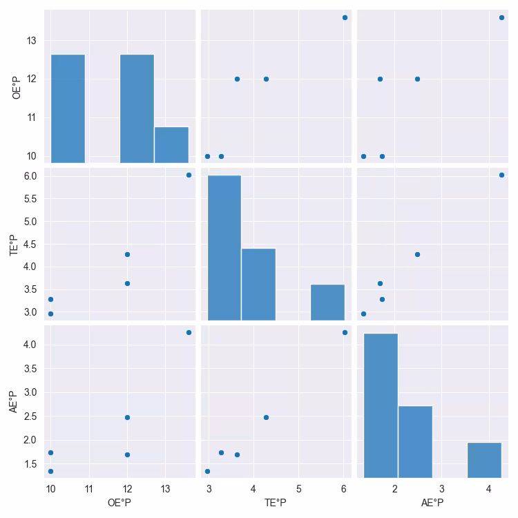
When there are several columns of data it may be useful to check on correlations across the columns. In this instance use pairplots, which are well supported in Seaborn. Each column is paired with every other column and then shown again with opposite axes. Pairing every column often makes little sense, select those columns that are related.
Show/Hide Code brew_list_paired.py
import seaborn as sns
import matplotlib.pyplot as plt
import pandas as pd

sns.set_style('darkgrid')
dfc = pd.read_pickle("../csv/beer_list_cont.pkl")

# reading the original, total and apparent extracts
cols_to_plot = ['OE°P', 'TE°P', 'AE°P']
sns.pairplot(dfc[cols_to_plot])
plt.show()
#plt.savefig('../figures/br_list_paired.png')
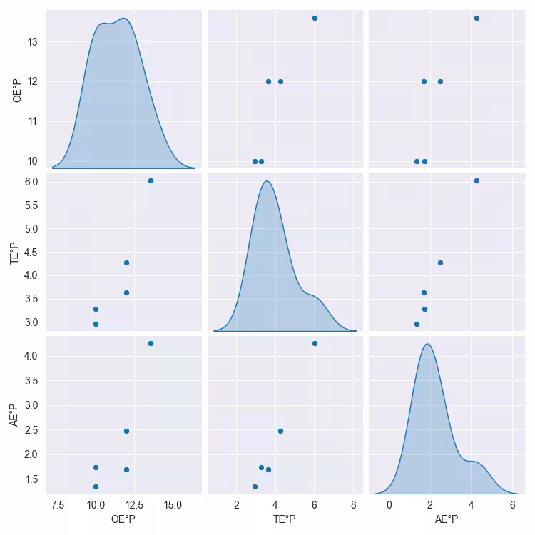
Change the diagonal from histogram to kernel density estimate (KDE)
Show/Hide Code brew_list_paired_kde.py
import seaborn as sns
import matplotlib.pyplot as plt
import pandas as pd

sns.set_style('darkgrid')
dfc = pd.read_pickle("../csv/beer_list_cont.pkl")

# reading the original, total and apparent extracts
cols_to_plot = ['OE°P', 'TE°P', 'AE°P']
sns.pairplot(dfc[cols_to_plot], diag_kind='kde')
plt.show()
#plt.savefig('../figures/br_list_paired_kde.png')
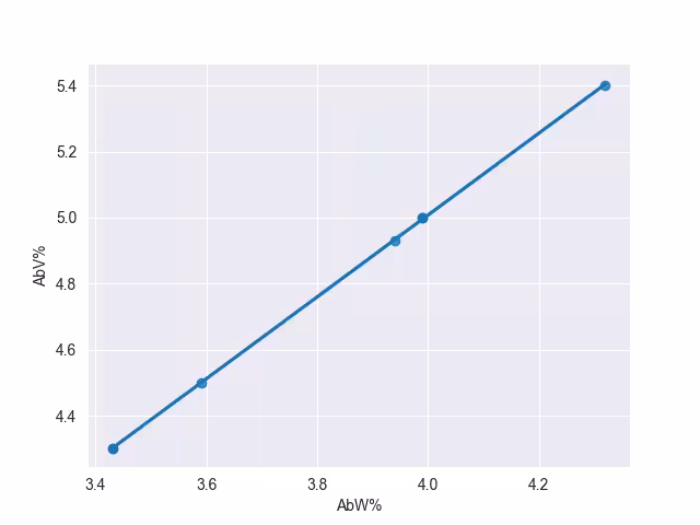
Change the columns to AbV% AbW%, alcohol by volume and weight in %, these ought to be in a straight line, check by drawing a regression line.
Show/Hide Code brew_list_scatter_regression.py
import seaborn as sns
import matplotlib.pyplot as plt
import pandas as pd

sns.set_style('darkgrid')
dfc = pd.read_pickle("../csv/beer_list_cont.pkl")

# reading the Alcohol strength, by volume and weight
sns.regplot(dfc, x='AbW%', y='AbV%')
plt.show()
#plt.savefig('../figures/brew_list_scatter_regression.png')
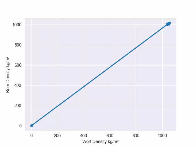
Now try with the wort and beer densities.
Show/Hide Code brew_list_regplot_densities.py
import seaborn as sns
import matplotlib.pyplot as plt
import pandas as pd

sns.set_style('darkgrid')
dfc = pd.read_pickle("../csv/beer_list_cont.pkl")

# reading the wort and beer densities
sns.regplot(dfc, x='Wort Density kg/m³', y='Beer Density kg/m³', ci=None)
plt.show()
#plt.savefig('../figures/brew_list_regplot_densities.png')
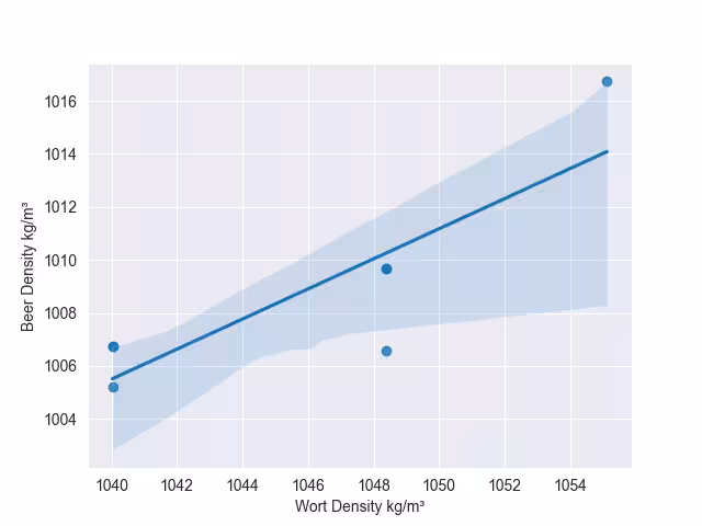
The densities show up the fact that there is some false data here, these need to be recalculated for Zlaty Bazant 12. Change the wort density to 1048.37 and the beer density to 1009.69. Zlaty Bazant 12 and Pilsner Urquelle 12 are similar.
Show/Hide Code brew_list_regplot_densities_rev.py
import seaborn as sns
import matplotlib.pyplot as plt
import pandas as pd

sns.set_style('darkgrid')
dfc = pd.read_pickle("../csv/beer_list_cont.pkl")
dfc.loc[10, ['Wort Density kg/m³']] = [1048.37]
dfc.loc[10, ['Beer Density kg/m³']] = [1009.69]

# reading the wort and beer densities
sns.regplot(dfc, x='Wort Density kg/m³', y='Beer Density kg/m³')
plt.show()
#plt.savefig('../figures/brew_list_regplot_densities_rev.png')
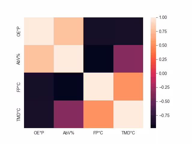
If there is a strong relationship between 3 variables, consider a heat map. Just as done with categorized data the third variable shows as a color, but the colour is graduated to visualize the value of the third variable. Seaborn provides a good platform to plot the data, select the columns which may be related, then use the correlation function and plot the heatmap.
Show/Hide Code brew_list_heatmap.py
import seaborn as sns
import matplotlib.pyplot as plt
import pandas as pd

sns.set_style('darkgrid')
dfc = pd.read_pickle("../csv/beer_list_cont.pkl")
dfch = dfc[['OE°P', 'AbV%', 'FP°C', 'TMD°C']]
print(dfch)
corr = dfch.corr()
sns.heatmap(corr)

plt.show()
#plt.savefig('../figures/brew_list_heatmap.png')
Positive correlation shows that the two independant variables move in the same direction, negative shows they move in opposite directions. The correlation function goes from +1.0 to -1.0. When using the correlation function both x and y axes contain the reduced number of columns, otherwise the heat map would have used all the columns in the y axis and just the reduced number of columns for the x axis:
dfch.corr()
           OE°P      AbV%      FP°C     TMD°C
OE°P   1.000000  0.770224 -0.880483 -0.865756
AbV%   0.770224  1.000000 -0.980466 -0.347714
FP°C  -0.880483 -0.980466  1.000000  0.525171
TMD°C -0.865756 -0.347714  0.525171  1.000000
If the default colours are not clear enough use a divergent colour map.
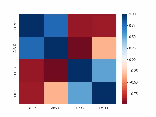
Show/Hide Code brew_list_heatmap_div.py
import seaborn as sns
import matplotlib.pyplot as plt
import pandas as pd

sns.set_style('darkgrid')
dfc = pd.read_pickle("../csv/beer_list_cont.pkl")
dfch = dfc[['OE°P', 'AbV%', 'FP°C', 'TMD°C']]
corr = dfch.corr()
sns.heatmap(corr, cmap='RdBu')
plt.show()
#plt.savefig('../figures/brew_list_heatmap_div.png')
After using a heatmap consider using a clustermap. This highlights how similar features are grouped.
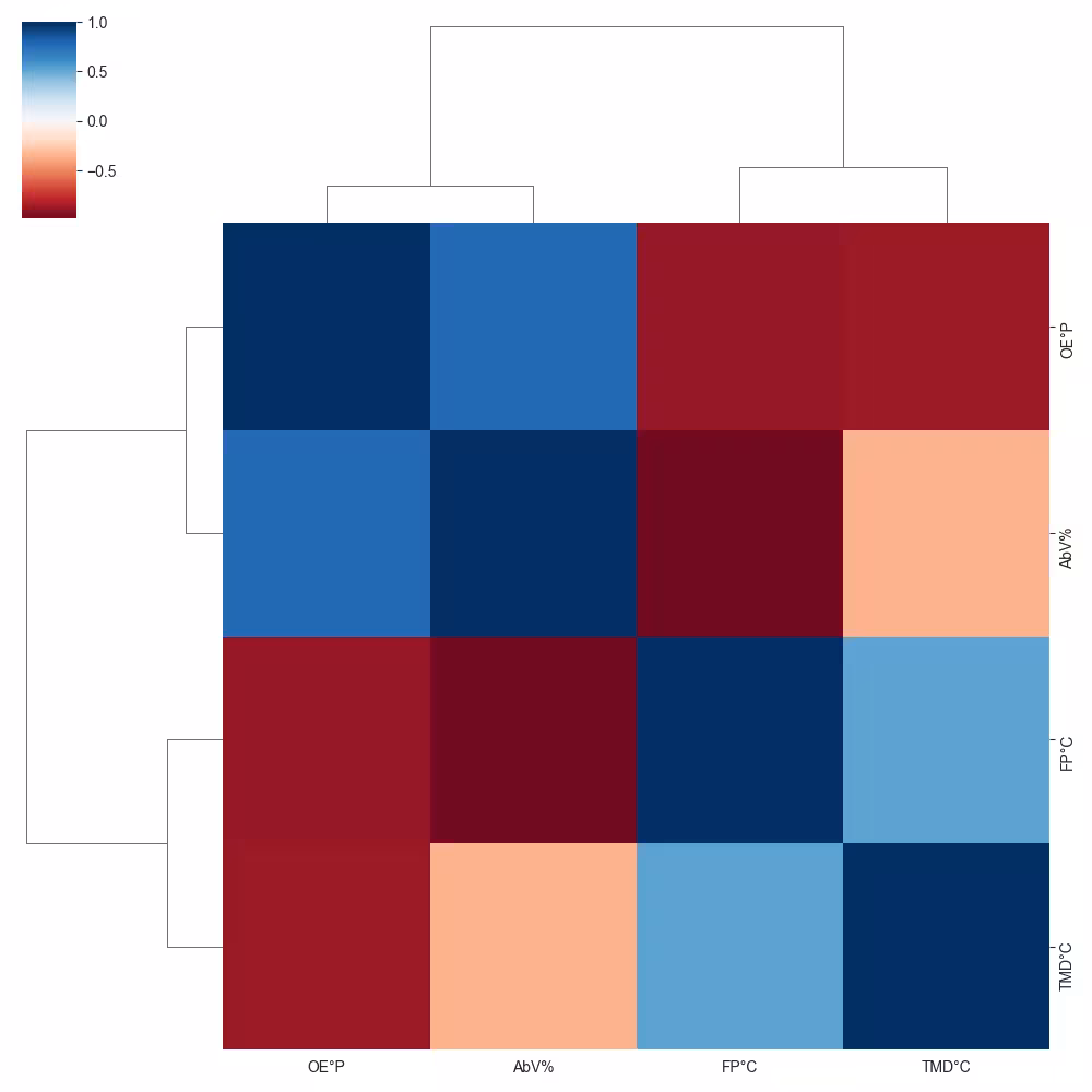
Show/Hide Code brew_list_clustermap_div.py
import seaborn as sns
import matplotlib.pyplot as plt
import pandas as pd

sns.set_style('darkgrid')
dfc = pd.read_pickle("../csv/beer_list_cont.pkl")
dfch = dfc[['OE°P', 'AbV%', 'FP°C', 'TMD°C']]
corr = dfch.corr()
sns.clustermap(corr, cmap='RdBu')
plt.show()
#plt.savefig('../figures/brew_list_clustermap_div.png')
Statisical Visualisation#
With larger dataframes some form of statistical visualisation may be required. Running KDE options has already been shown in principle together with linear regression data and confidence limits. This can be extended in Seaborn by using box and violin plots.
The boxplot splits the distribution of the data into four quartiles, the middle two are the box element, the outer two are the whisker elements, outlyers are shown as points beyond the whiskers. The box is divided at the median. The ends of the whiskers show the calculated minimum and maximum values. All this assumes the data lies in a bell shaped distribution.
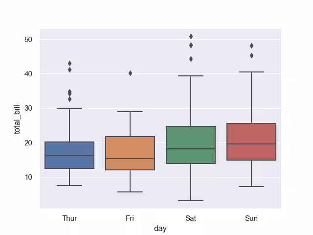
Show/Hide Code tips_box.py
import seaborn as sns
import matplotlib.pyplot as plt

sns.set_theme(style="darkgrid")
# Load the example tips dataset
tips = sns.load_dataset("tips")

sns.boxplot(data=tips, x='day', y='total_bill')

plt.show()
#plt.savefig('../figures/tips_box.png')
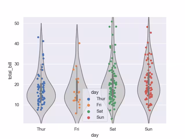
The violin plot shows the distribution of quantitative data across several levels of one (or more) categorical variables in order to compare distributions. Underlying the plot are KDE distributions so ensure that there is enough data so that the plots are not artificially smoothed.
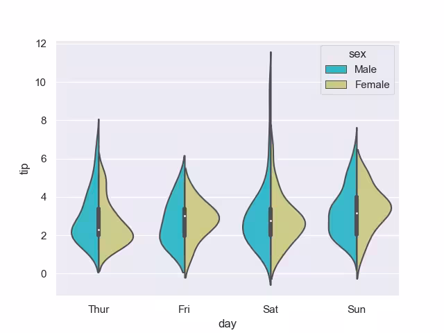
Show/Hide Code tips_violin.py
import matplotlib.pyplot as plt
import seaborn as sns
sns.set_theme(style='darkgrid')

tips = sns.load_dataset('tips')

sns.violinplot(x = 'day',y = 'tip',  data = tips, hue = 'sex', split = True, palette = 'rainbow')

plt.show()
#plt.savefig('../figures/tips_violin.png')
A nice feature of violin plots is that two categorical datatypes can be compared directly.
A strip plot can be used on its own or in combination with a box or violin plot.
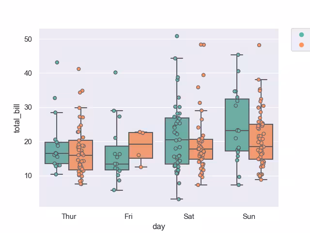
Show/Hide Code tips_box_strip.py
import matplotlib.pyplot as plt
import seaborn as sns

sns.set_theme(style='darkgrid')
# superimpose box and strip plots

tips = sns.load_dataset("tips")
# jitter places points apart in same data set, dodge separates different categories
sns.stripplot(x="day", y="total_bill", hue="smoker",
data=tips, jitter=True,
palette="Set2", dodge=True,linewidth=1,edgecolor='gray')

# Get the ax object to use later.
ax = sns.boxplot(x="day", y="total_bill", hue="smoker",
data=tips,palette="Set2",fliersize=0)

# Get the handles and labels. For this example it'll be 2 tuples
# of length 4 each.
handles, labels = ax.get_legend_handles_labels()

# When creating the legend, only use the first two elements
# to effectively remove the last two.
l = plt.legend(handles[0:2], labels[0:2], bbox_to_anchor=(1.05, 1), loc=2, borderaxespad=0.)

plt.show()
#plt.savefig('../figures/tips_box_strip.png')
When using the violin plot the mean/standard bar might be masked by the stripplot points, bring the stripplot forward by adding zorder=1.
Show/Hide Code tips_violin_strip.py
import matplotlib.pyplot as plt
import seaborn as sns

sns.set_theme(style='darkgrid')
# superimpose box and strip plots

tips = sns.load_dataset("tips")
# jitter places points apart in same data set, dodge separates different categories
sns.violinplot(x="day", y="total_bill", data=tips, color="0.8")
sns.stripplot(x="day", y="total_bill", data=tips, jitter=True, zorder=1, hue='day')

plt.show()
#plt.savefig('../figures/tips_violin_strip.png')
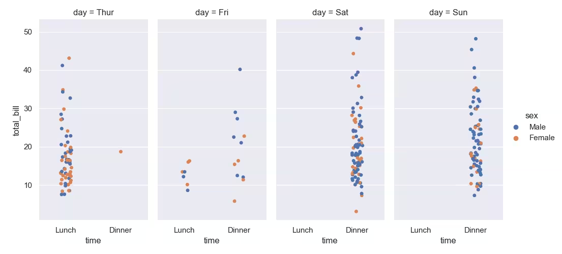
To make a plot with multiple facets, it is safer to use catplot() than to work with FacetGrid directly, because catplot() will ensure that the categorical and hue variables are properly synchronized in each facet.
Show/Hide Code tips_catplot.py
import matplotlib.pyplot as plt
import seaborn as sns

sns.set_theme(style='darkgrid')
# Load the example tips dataset
tips = sns.load_dataset('tips')

sns.catplot(data=tips, x="time", y="total_bill", hue="sex", col="day", aspect=.5)

plt.show()
#plt.savefig('../figures/tips_catplot.png')
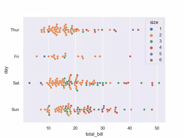
A swarmplot is similar to the striplot, but the points have been automatically adjusted, so jitter is no longer required.
Show/Hide Code tips_swarmplot.py
import seaborn as sns
import matplotlib.pyplot as plt

sns.set_theme(style="darkgrid")
# Load the example tips dataset
tips = sns.load_dataset("tips")

sns.swarmplot(data=tips, x="total_bill", y="day", hue="size", palette="deep")

plt.show()
#plt.savefig('../figures/tips_swarmplot.png')
Storage Format#
Select the storage format that best suits your requirements. Both csv and pickle formats are easily loaded and saved from python scripts. For smaller dataframes csv is acceptable but think of different formats for larger dataframes. As always test thoroughly before changing formats.